
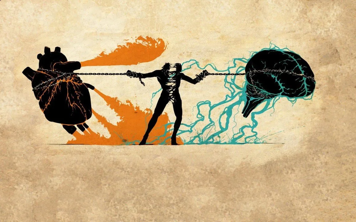
Like twins fighting for their mother’s attention, art & design have always had, at best, a symbiotic relationship. And like many twins, people have trouble telling them apart.
To address this as effectively as possible, I incorporated this exercise into my design history course. The first assignment is “Book of Kells” - art or design? To further that discussion, we first established a simple definition for both art & design. We decided that art is “anything that provokes an emotional response.” As Mark Twain supposedly said, “I saw a man spit over 20 boxcars, now that’s art.” Or the ever-popular belief that “art is in the eye of the beholder.” That doesn’t mean everyone is qualified to declare what art is. It just means that without the viewer, it may not be art. Art occurs when the viewer responds to the piece, like the tree falling logic. A painting, a sculpture, a print, a photograph, good music, a good meal, a fine night out, it is all art. If it evokes a feeling, it is art.
The design definition we agreed on was “anything that serves a purpose.” So whether it is an industrial design, architectural design, automotive design, or visual design, if it successfully serves a purpose, it is design. And here comes the argument, and even worse heresy, while “design” is often seen as a subset of “art,” just a part of the process, it is actually the opposite. This occurs because many people confuse design with composition. A painting, a drawing, a sculpture, or a photograph can have a good or bad composition. That composition is the byproduct of design; it is not design itself. Design is about creating a solution to a problem - the purpose behind the work.
And here is where the rubber meets the road - if art is “anything that provokes an emotional response,” and design is “anything that serves a purpose,” wouldn’t art be a subset of design? Isn’t the purpose of art to evoke an emotional response? And since design is a structure under which all things that serve a purpose fall, isn’t it logical to conclude that art is a subset of this category? Yikes! Blasphemy? Not really- because as Dr. John Maeda is quoted as saying, “The sciences are what we do to enjoy art.” Yes, enjoying art is the reward, but so can be doing the sciences.
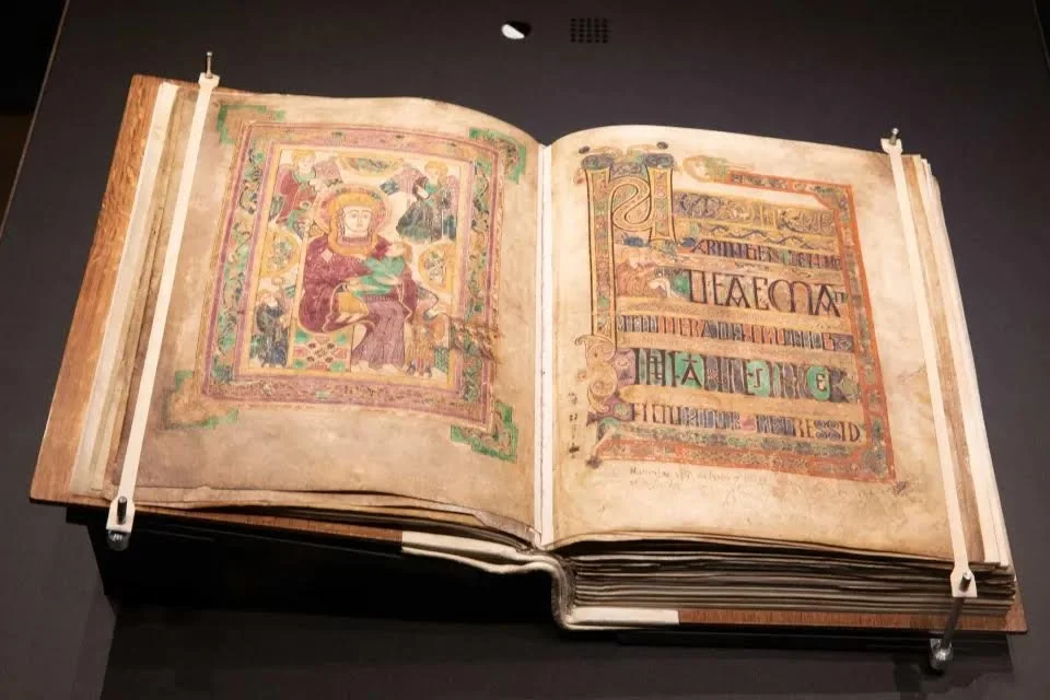
Back to the “Book of Kells” argument. Which is it - art or design? If you are not familiar with the Book of Kells, here is a quick definition from Trinity College.
The Book of Kells pages are decorated with bright colours, elaborate knotwork, and detailed illustrations of animals and mythical creatures. The manuscript is a wonderful example of the artistic style known as Insular art. This style is characterised by intricate detail, patterns, zoomorphic and curvilinear motifs, a vibrant colour palette. The manuscript measures 13 inches by 10 inches. Originally bound in a single volume, the Book of Kells was later divided into four volumes. As a complete gospels manuscript, it contains the four Gospels of the New Testament (Matthew, Mark, Luke, and John).
When we raise the question, “Did the Book of Kells have a purpose?” the answer is always, “Yes. To advance Christianity in a pagan world.” Since most people could not read, they used images over the written word and even animalistic images to portray the disciples. This is supposed to allow for the transition from paganism to Christianity. So again, purpose. In the case of the Book of Kells, the purpose was derived from using art to convey the message of importance and simply to create awe. Here again is the symbiotic relationship, but we must agree that purpose drove the creation of the artifact.
Now we step towards fine art, where composition replaces design as the governing feature. In many cases, with representational art and especially in the art of the Renaissance, you see a triadic harmony occurring. By this, we mean a constant movement from the main object to subdominant objects that leads the viewer in a triangle of motion in order to keep the viewer from “leaving” the page. This is done so that the viewer maintains the subject as the message. Even in something as meaningful as Michelangelo’s “Pieta,” the blessed mother is holding the Christ figure across her lap with her head, his head, and his feet completing the triangle. The viewer is contained within the triangle to keep the message in the forefront of the work.
As we get to modern art, this format slowly dissipates, especially in Abstract Expressionism. The most well-known of these artists may be Jackson Pollock. His rhythmic work doesn’t so much rely on composition as it does on the harmony of all elements through a personal motion. Here, design is seen through intent and not composition. In his Life Magazine interview, when asked about the subject of his paintings, Pollock responded,
“Today painters do not have to go to a subject matter outside of themselves. They work from within.”
Therefore, the work is fulfilling the design choice, regardless of the composition.
In visual design, the purpose and message are always the intent. Whatever the requested message or the intended message, the design must fulfill that purpose if it is to be successful. There cannot be opinion; there must be consensus. If we are looking to portray a brand, as in advertising design, the design must successfully portray the benefits of that brand. Typically, this is done most simply and concisely. The embodiment of simplicity in advertising is the “Got Milk” campaign. Two words, one image, and it has been successful for over 30 years. In all other forms of visual design, simplicity reigns. “Just Do It” - the FedEx logo - MasterCard’s “priceless” campaign. All simple concepts are met with simple images. All meant to convey a specific message. All is counting on a group understanding and agreement. This agreement makes the world go round.
Today, the most common form of design that we interact with is user experience design - or UX. UX is employed to build and develop apps and websites, or any form of digital environment. All phone apps or even streaming interfaces are examples of UX design. Here science meets design.
Usually requiring the deployment of technology, success is achieved through iterations. User interface elements are also developed - usually based on the metaphor - such as “$” for banking, notes for music, etc. Together with coding, these screens and icons aid the user on their journey or goal. Unlike gaming environments, app or web environments depend on a “frictionless” environment to be successful. Planning and iteration are extremely important to the process. Like an architect planning each stage, the UX designer needs to be inspirational and functional. Here is where the connection between art and design deepens.
Personally, the highpoint of art meeting design is the Guggenheim Museum. Designed by the holy father himself, the architect Frank Lloyd Wright, this building’s purpose is to give the most space possible to showcase artwork in a very crowded area of New York City. Wright does it with the perfect solution - the corkscrew spiral. At no point does the continuity break. The viewer is brought on a journey of never-ending steps until voilá, you are back where you started, ready to start again. A beautiful clean design allows the viewer no obstructions or containment in order to enjoy the art - the purpose of the design. This is to me the epitome of art and design. As Maeda said, “We do the sciences to enjoy the art.”
Patrick Aievoli
is the Chair of the Art, Design, and Game Development Department at Long Island University Post campus. Click here to get his most recent book - “rock•paper•pixels” published by Taylor and Francis, 2025.
G&E In Motion does not necessarily agree with the opinions of our guest bloggers. That would be boring and counterproductive. We have simply found the author’s thoughts to be interesting, intelligent, unique, insightful, and/or important. We may not agree on the words but we surely agree on their right to express them and proudly present this platform as a means to do so.